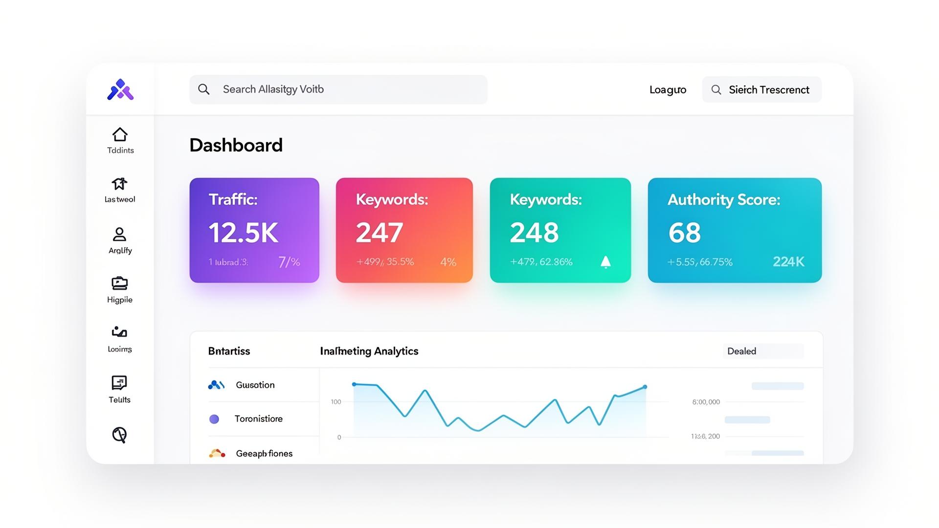
Quick answers about cluster map — written for humans and answer engines.
What does the cluster map show?
Every topic you compete in, on one screen. Each orb is a topic cluster. Bigger orbs mean more search demand. Colours show how healthy that cluster is. Lines show how authority flows from your main site to satellite content.
How is this different from a keyword tracker?
Keyword trackers list words. The cluster map shows your whole strategy — topics, authority, momentum, and gaps — in one picture. You see what's working, what's stuck, and what to do next without scrolling through endless tables.
Does the map update automatically?
Yes. We refresh rankings, traffic and AI mentions daily, and the map redraws itself. You can scrub a timeline to replay how your topic authority grew over the last 90 days — handy for spotting what actually moved the needle.